Perfect Properties
UX / UI Design
The Project
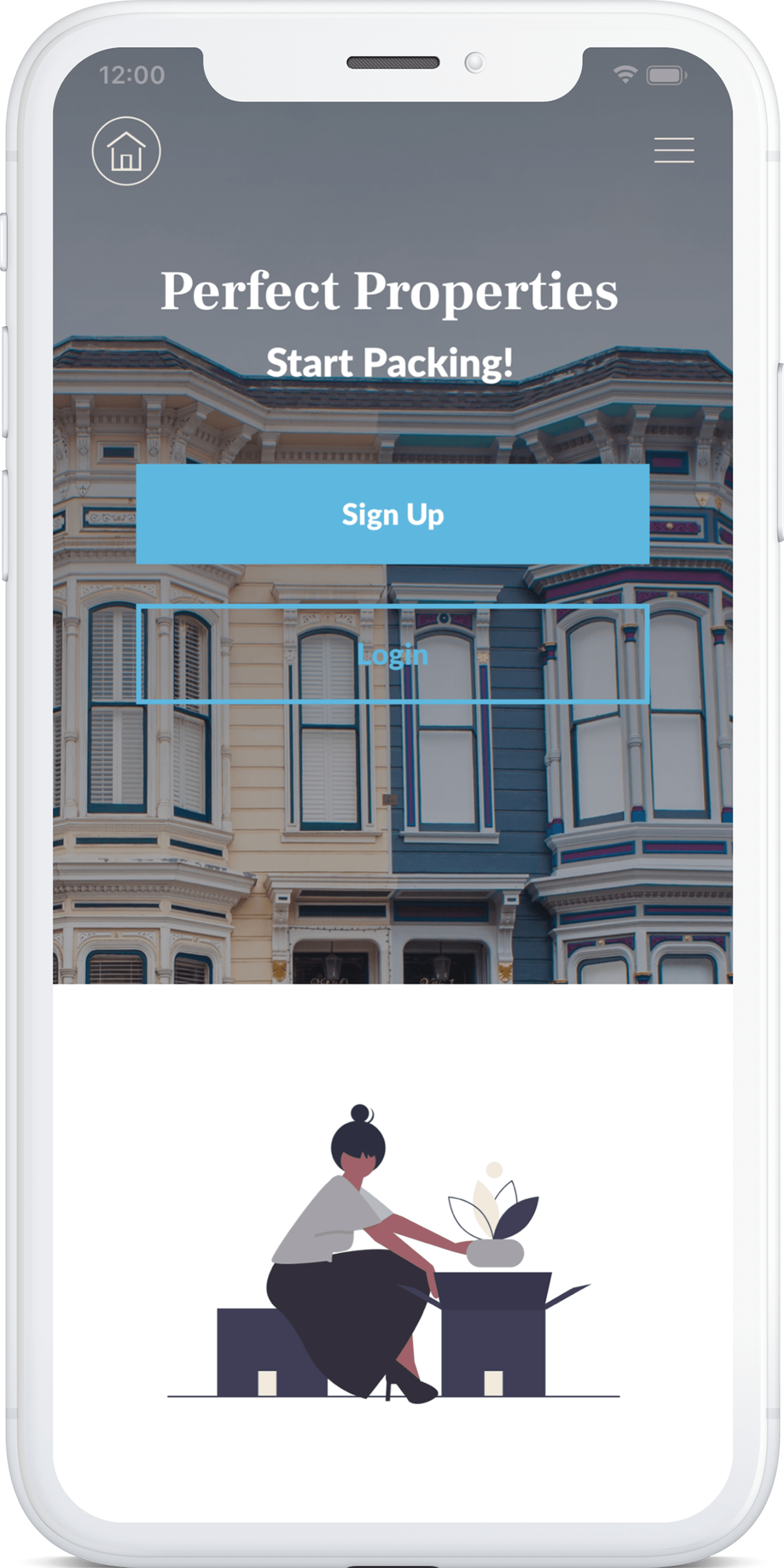
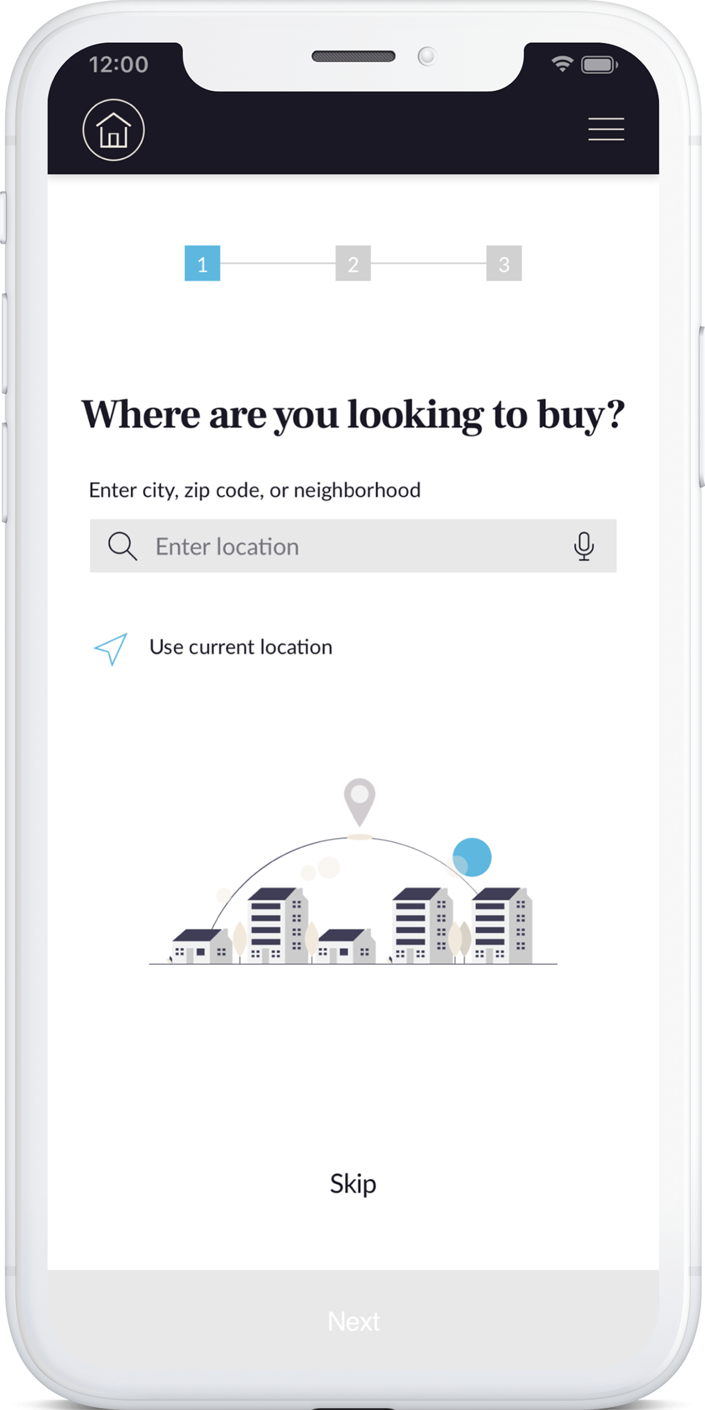
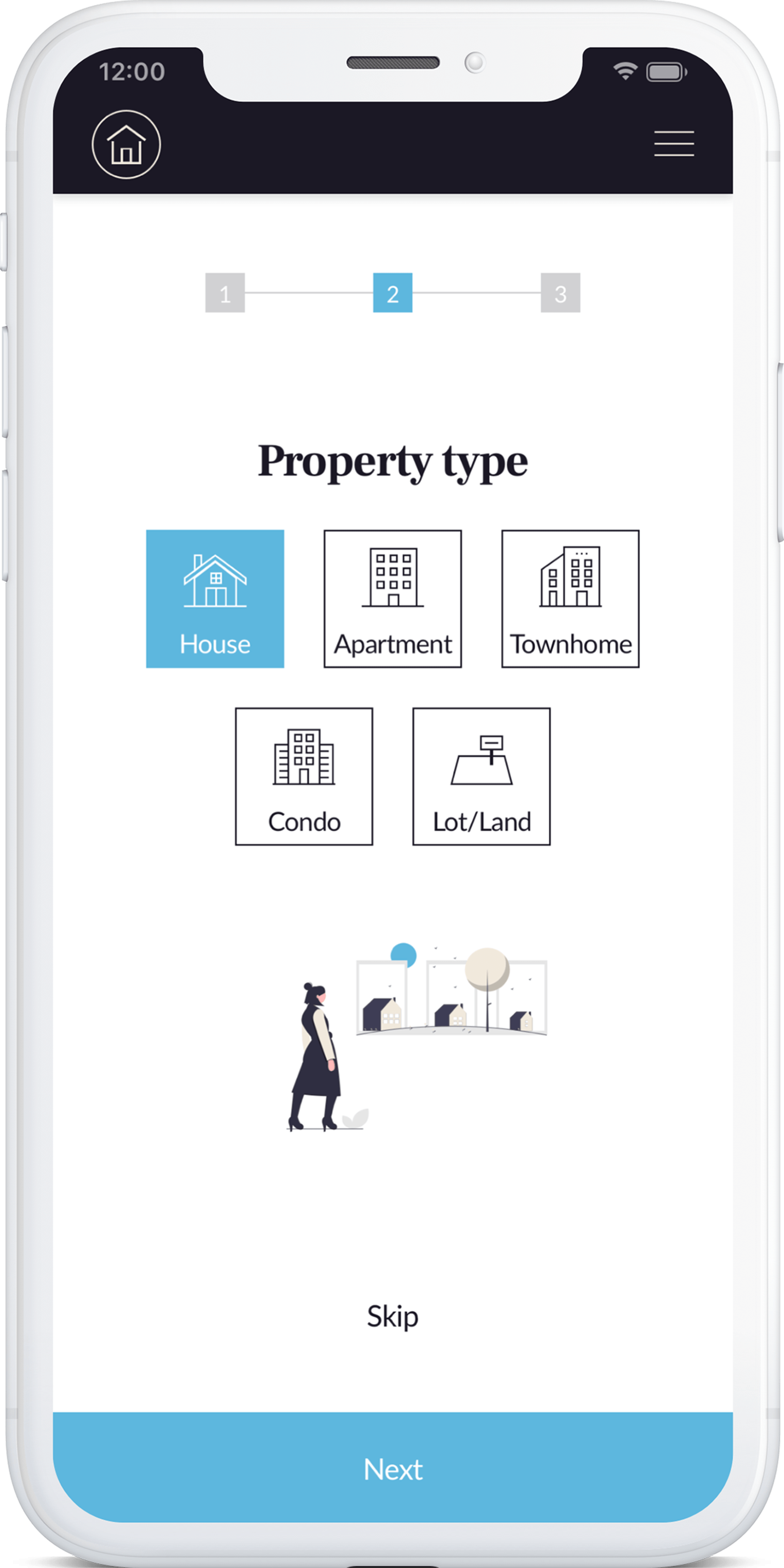
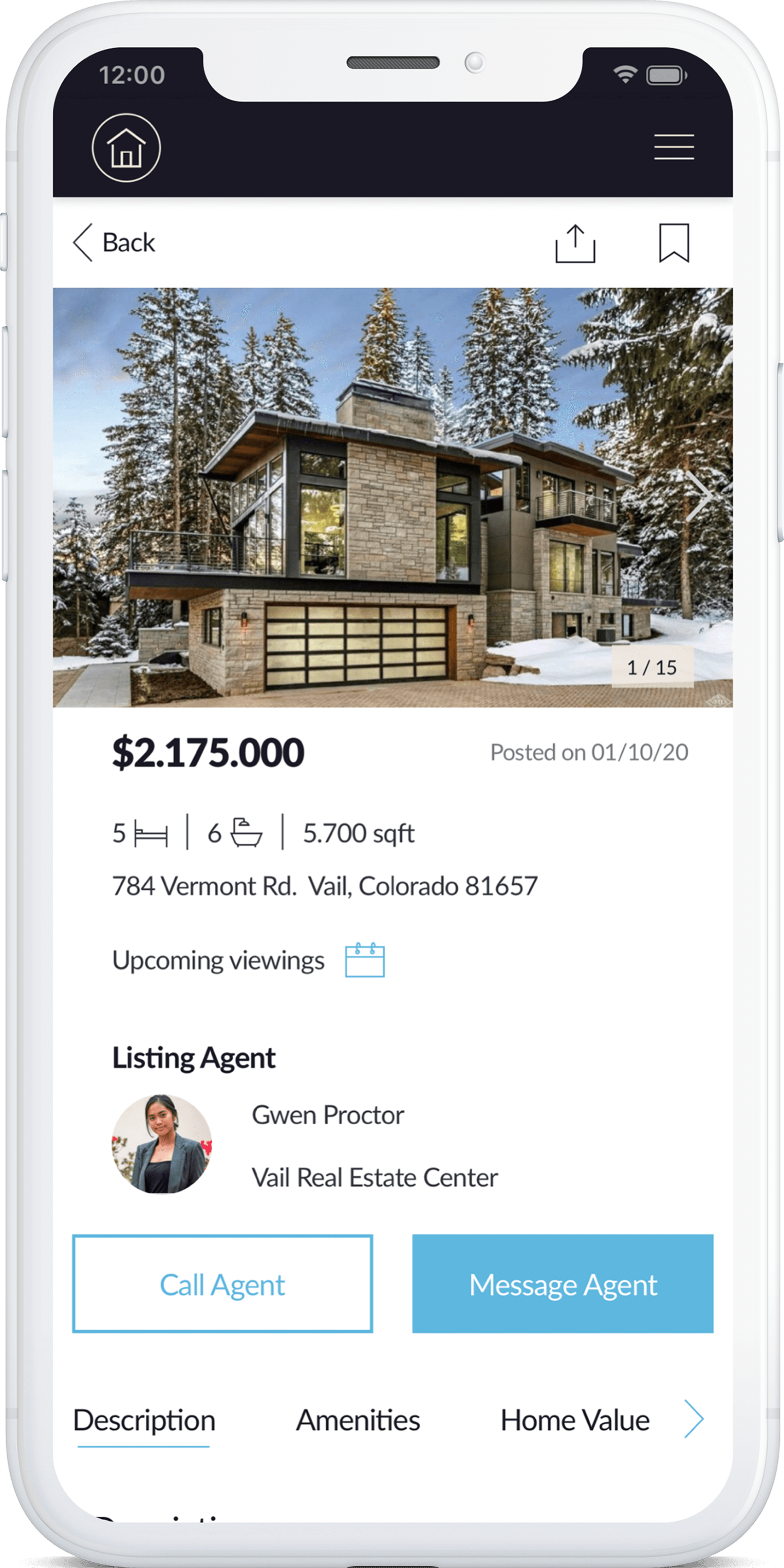
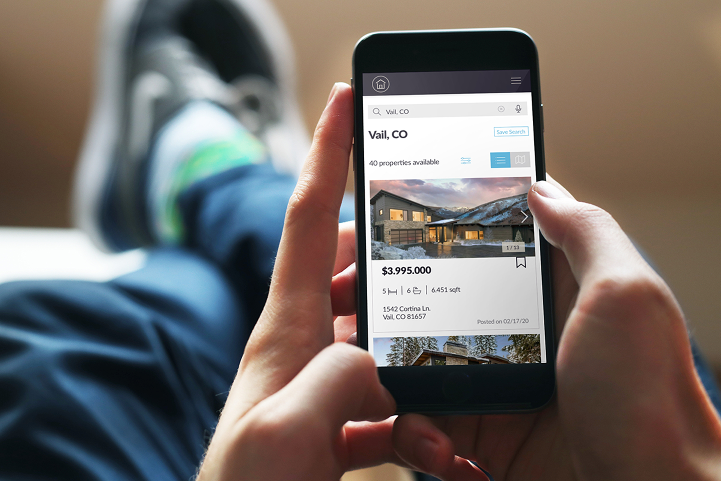
Perfect Properties is a real estate app that helps new buyers find the right home. It provides a clear and efficient tool to streamline their experience of searching for and purchasing a new home.
I was the sole designer on this project, and I was responsible for the UI design. I used Sketch for the designs, Invision for the prototype, and Principle for the animations.
Objective
I aimed to design a web app that provides users with the tools needed to navigate the complexities of a real estate market. I aimed to create simple, beautiful, and intuitive experiences to encourage confidence in new buyers.
Goals
The first step towards designing the interface was to analyze the user research to determine what the primary functionality would be. The two main goals of the app are:
Simplicity
A large amount of information needs to be presented in a simple and easy-to-understand manner so users do not get overwhelmed.
Efficiency
Users need clear and efficient ways to move through the web app to accomplish their goals.
User Flow Diagram
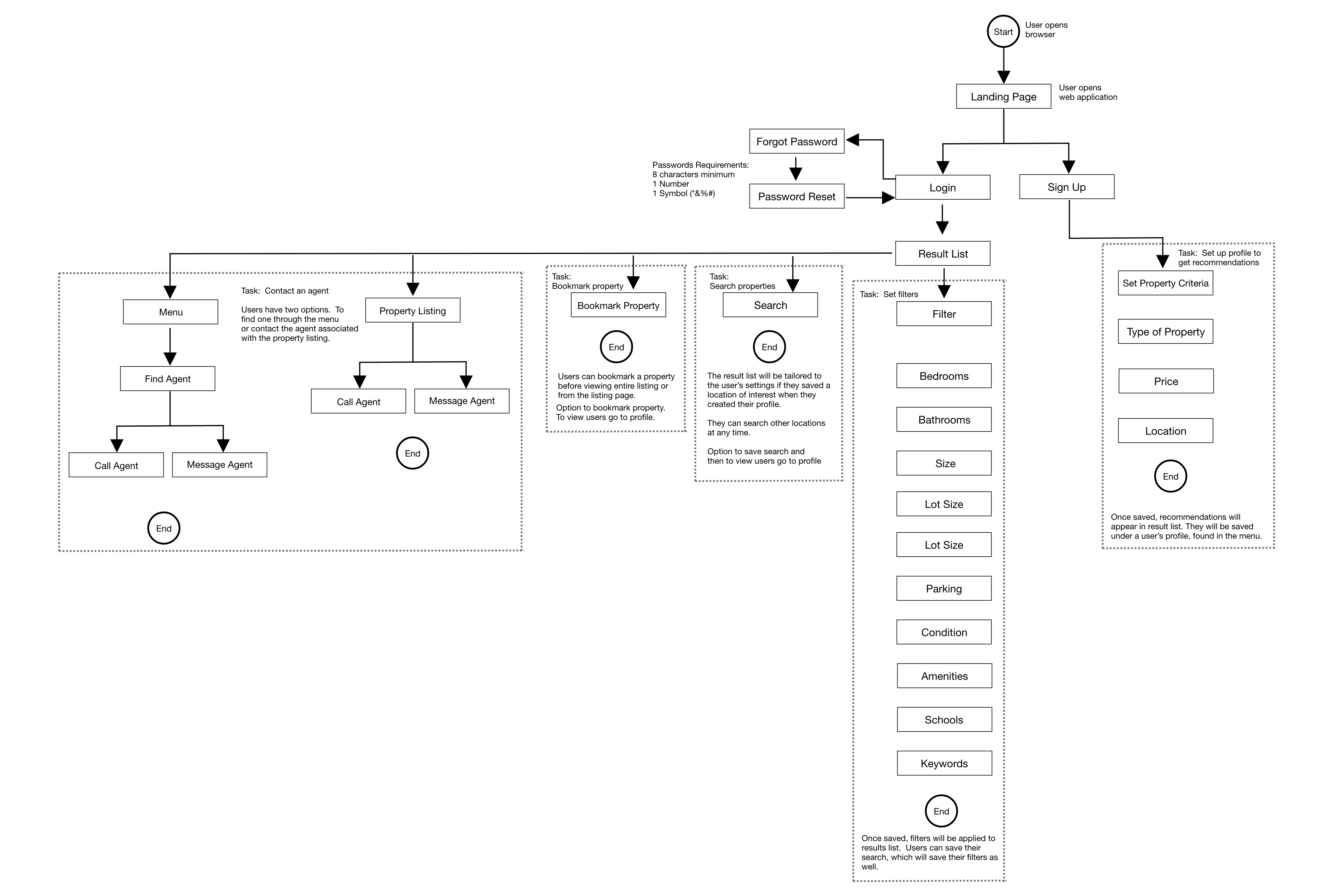
The flow chart below illustrates the primary functionality being designed and how users will be able to navigate through the web app.
Sketching & Wireframes
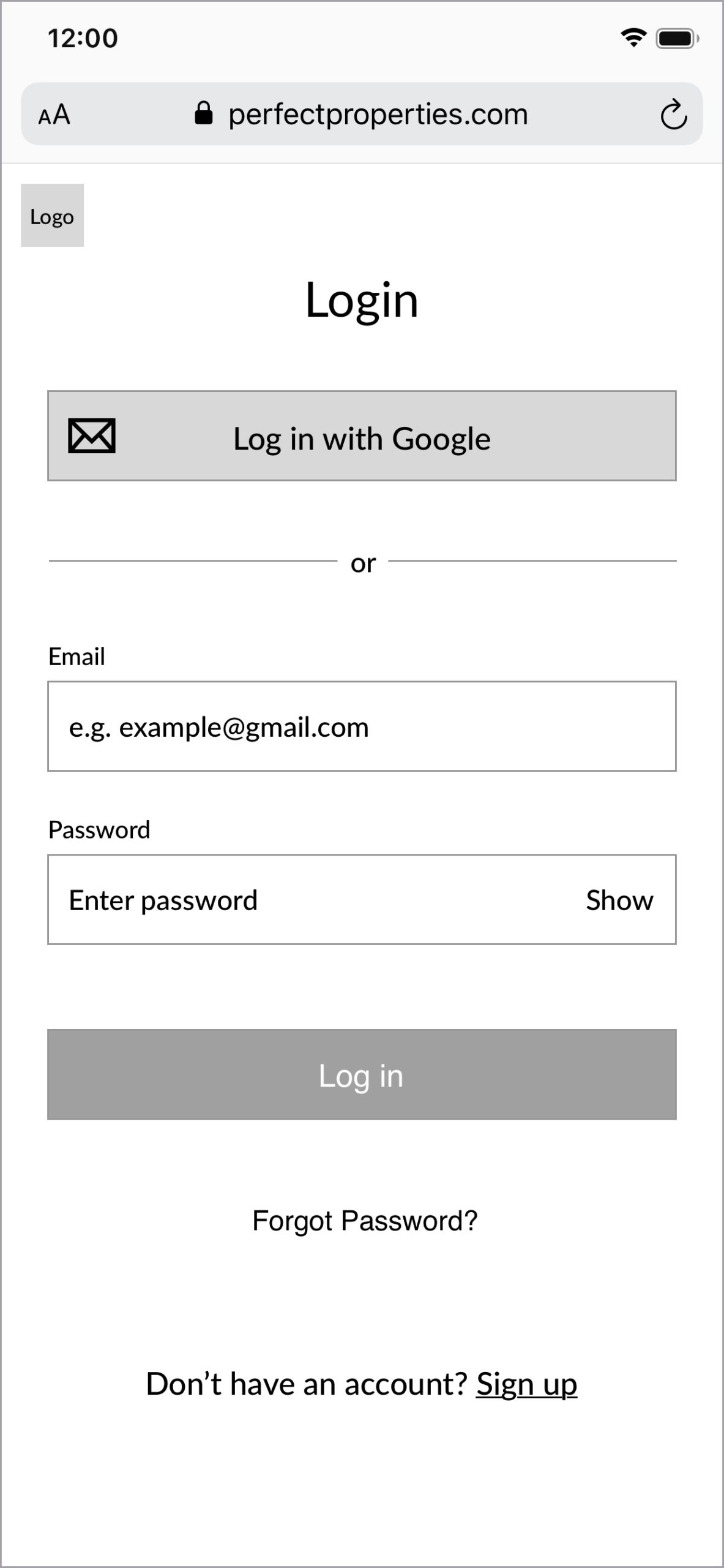
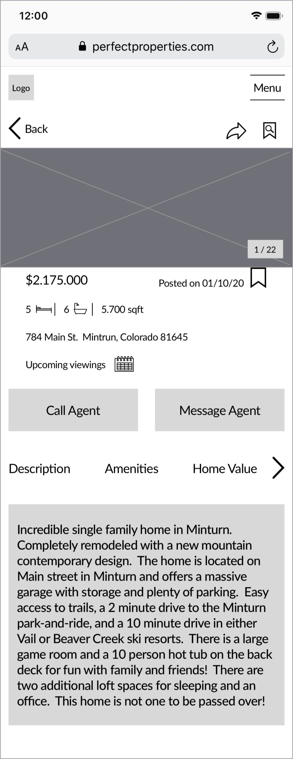
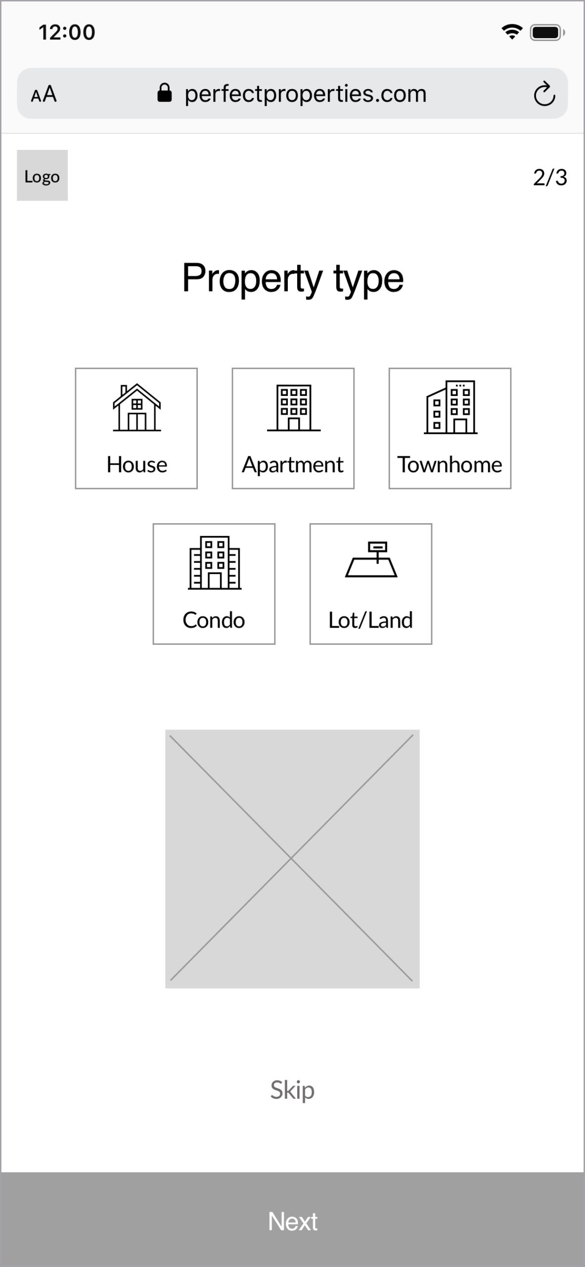
Once I had a clear idea of the journey users would take through the app I started sketching. I quickly drafted some sketches with pen and paper and then digitized the sketches to make my initial wireframes.

Visual Design
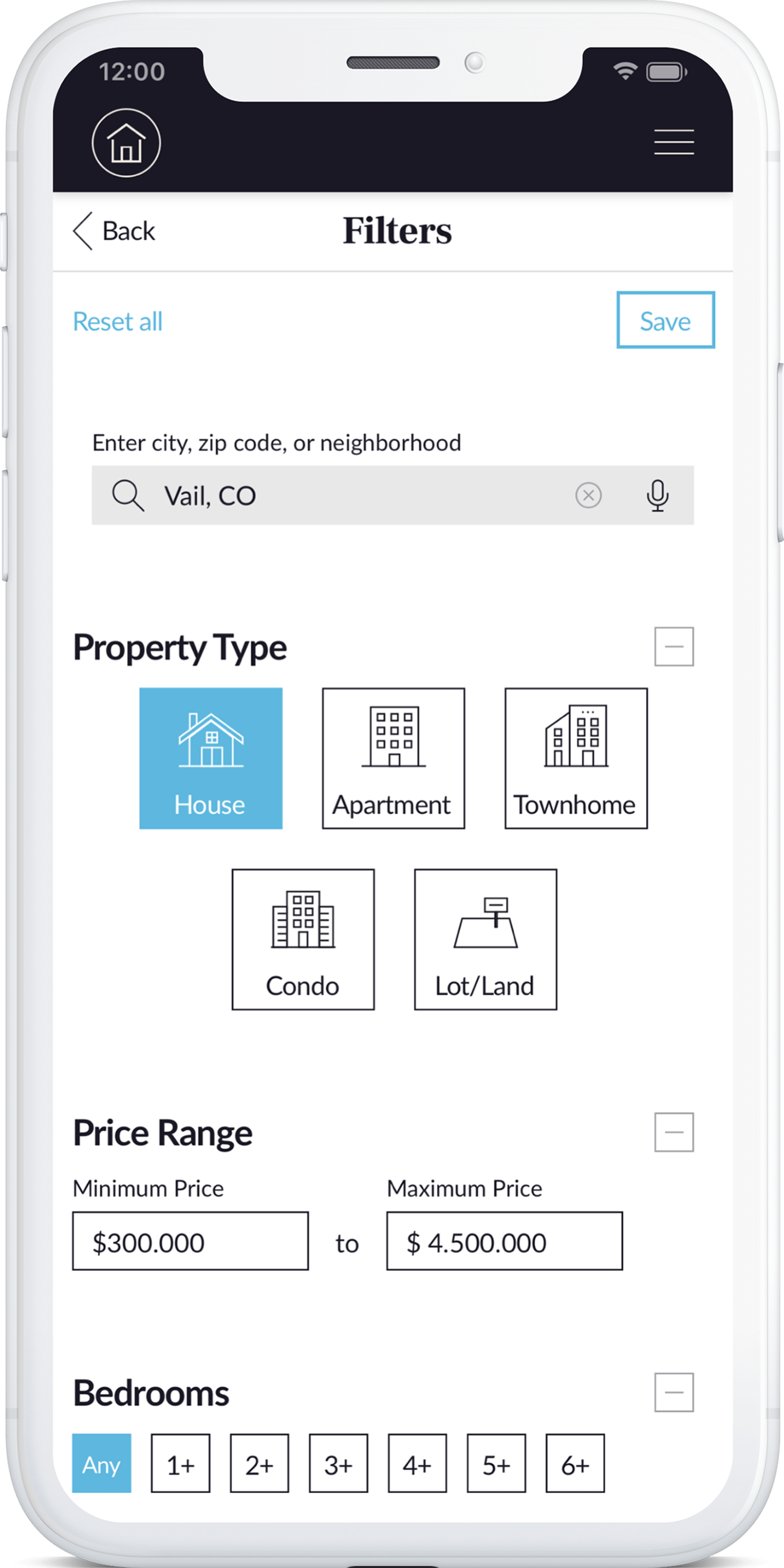
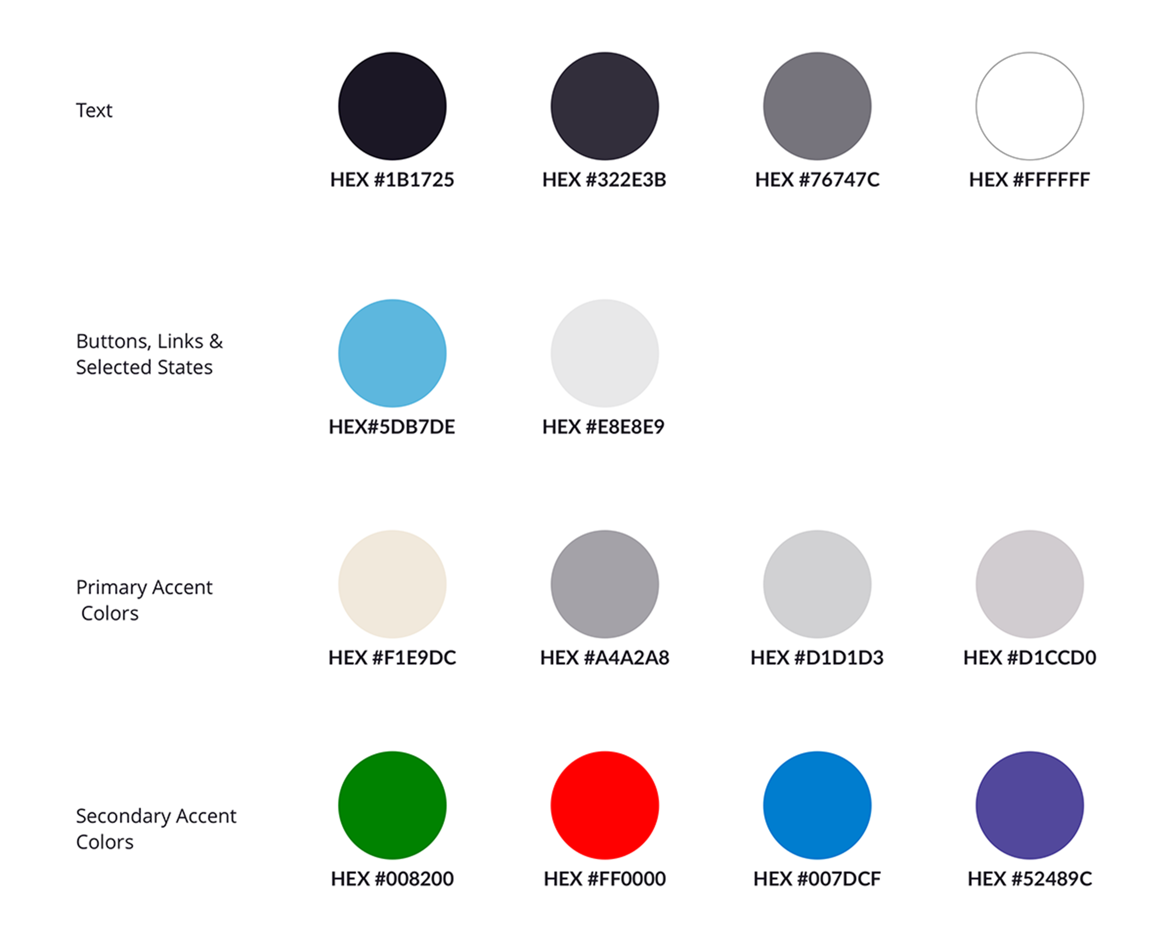
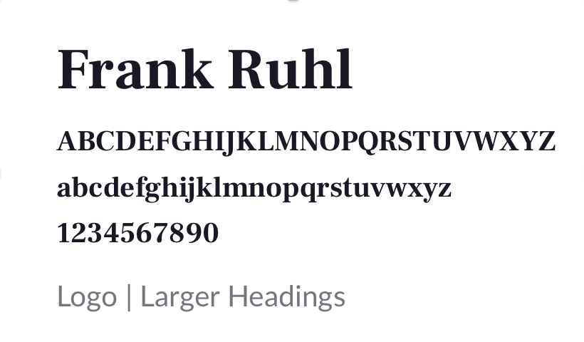
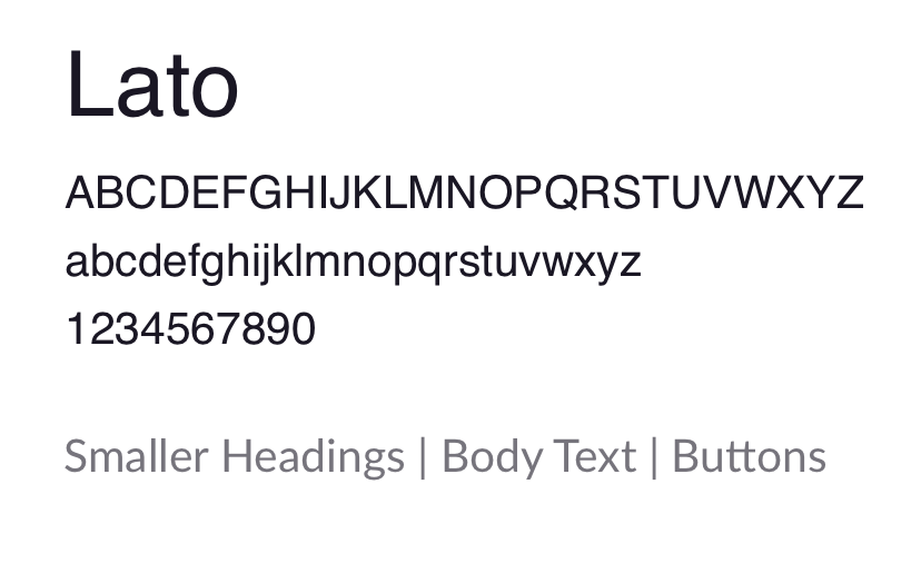
The visual design chosen for Perfect Properties maintains a light, modern, and professional feel. The icons, colors, and typography were chosen to further emphasize the brand and to promote the feeling of security users want when making an important decision such as buying a home.
Color Palette
Typography
Icons
Imagery
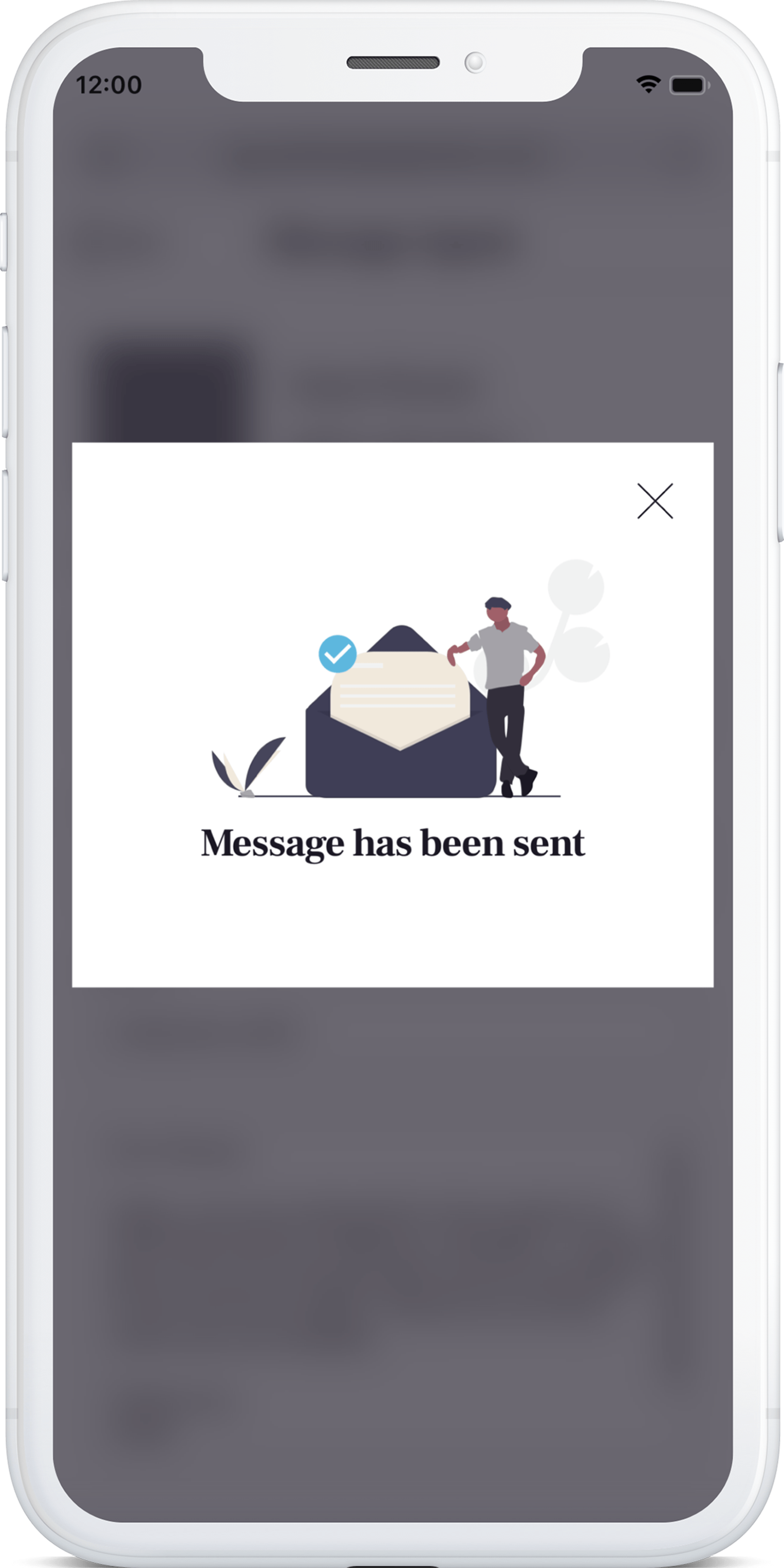
I chose to use illustrations throughout Perfect Properties for a few reasons. Firstly, they can be customized to the color palette which helps to maintain design consistency.
They have a softer quality to them which offers a nice balance to a real estate app that already displays many photos. In addition, I like the way these illustrations promote diversity and are vague enough that anyone can relate to them.


Animation
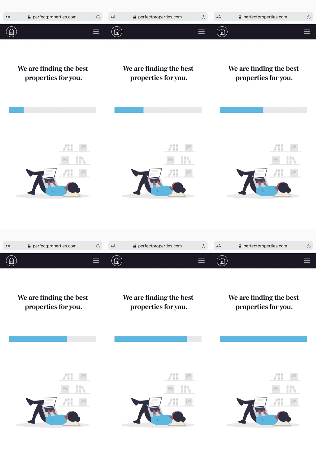
Loading animations were made in Principle to ease any potential waiting time the user may experience.
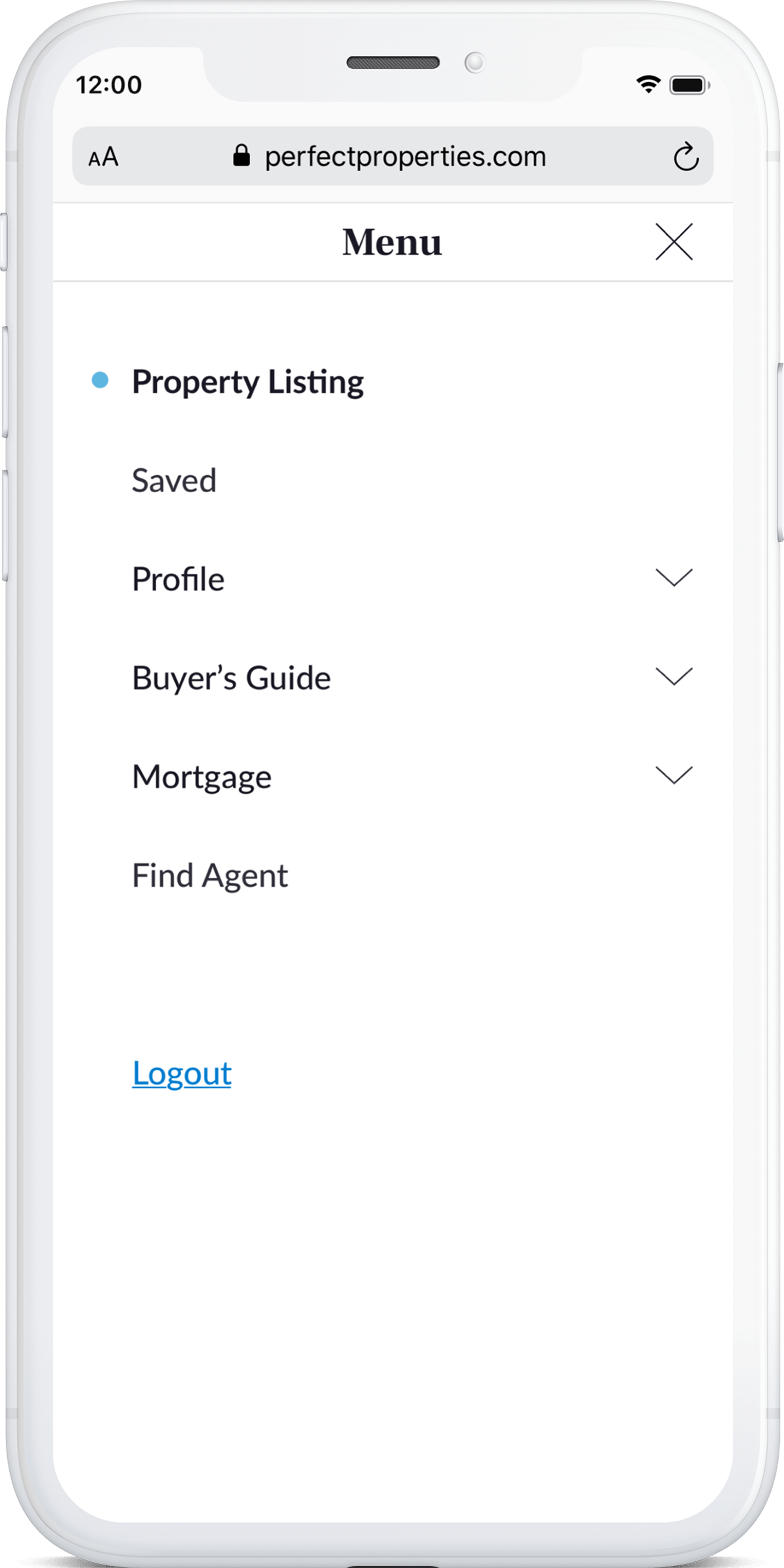
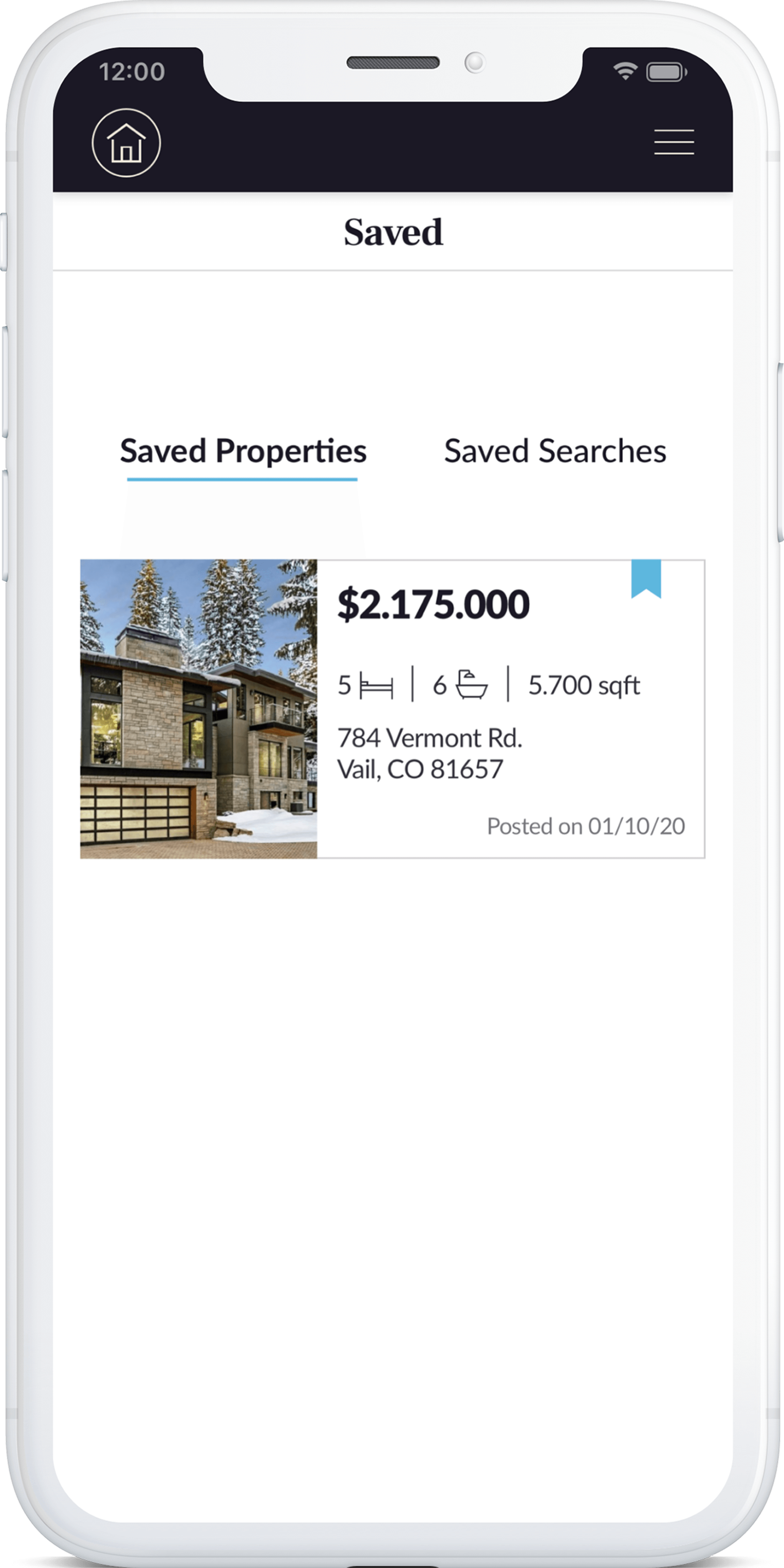
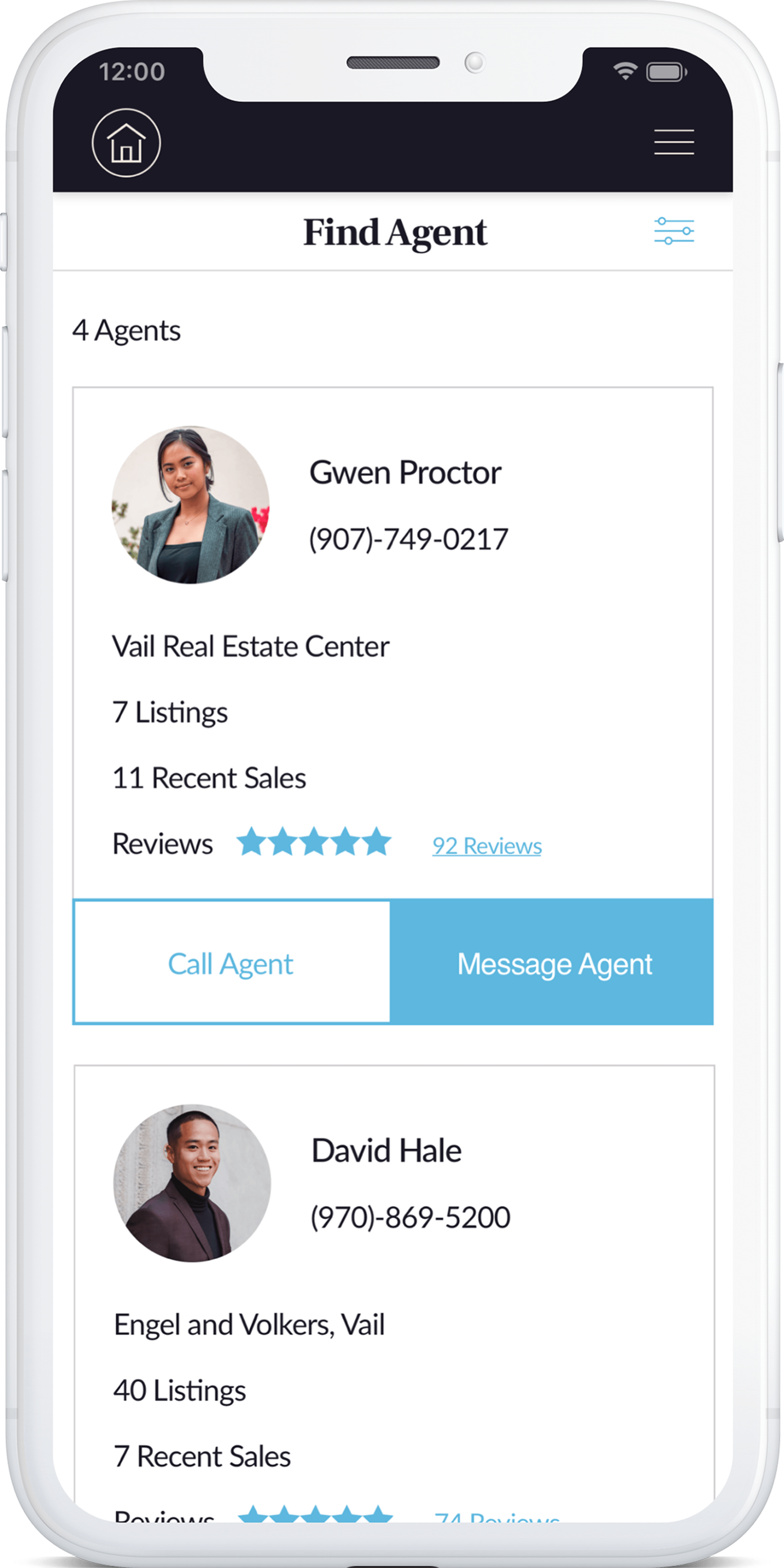
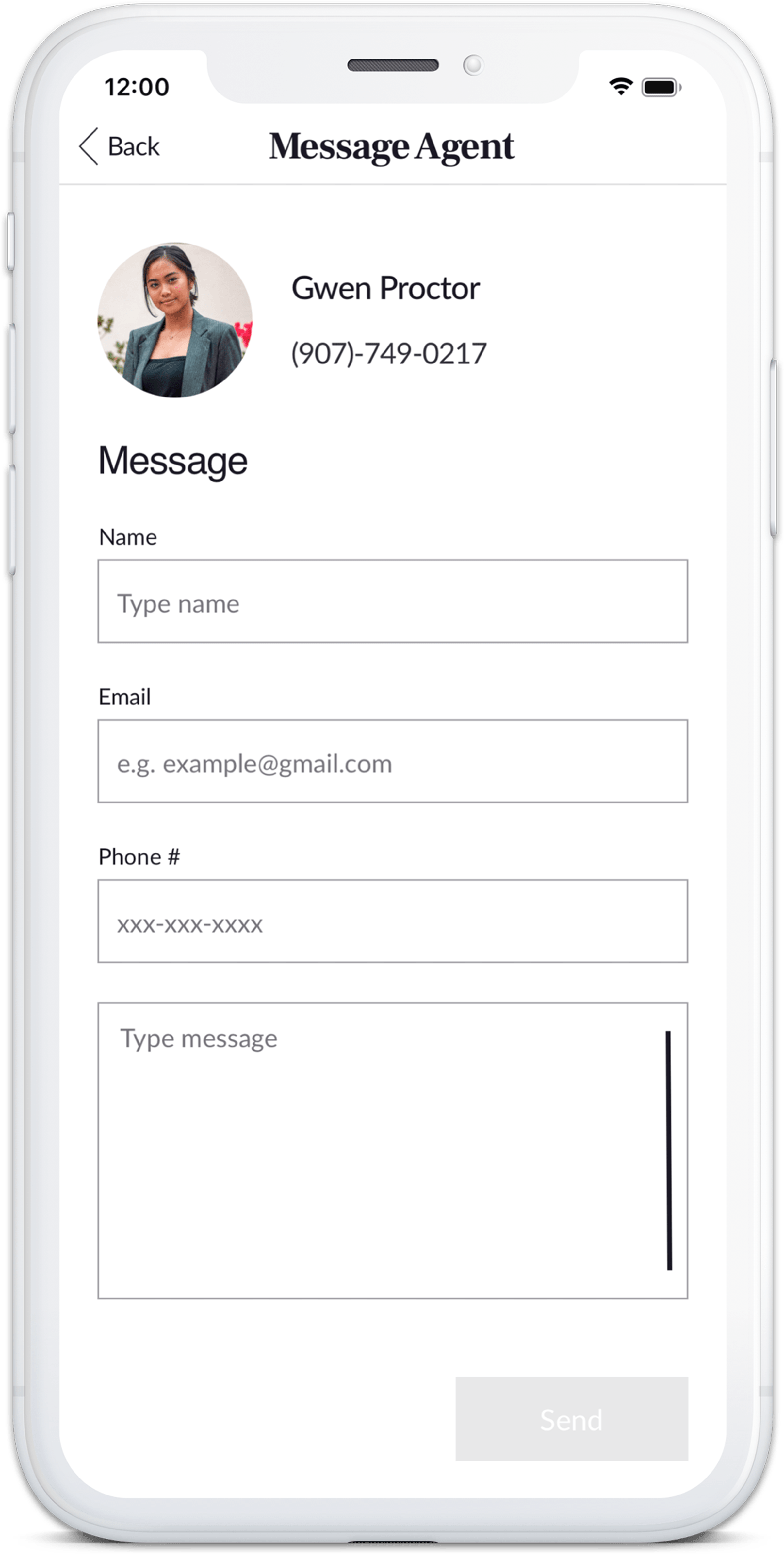
User Interface
Want to view the entire design?
Click below for the full prototype
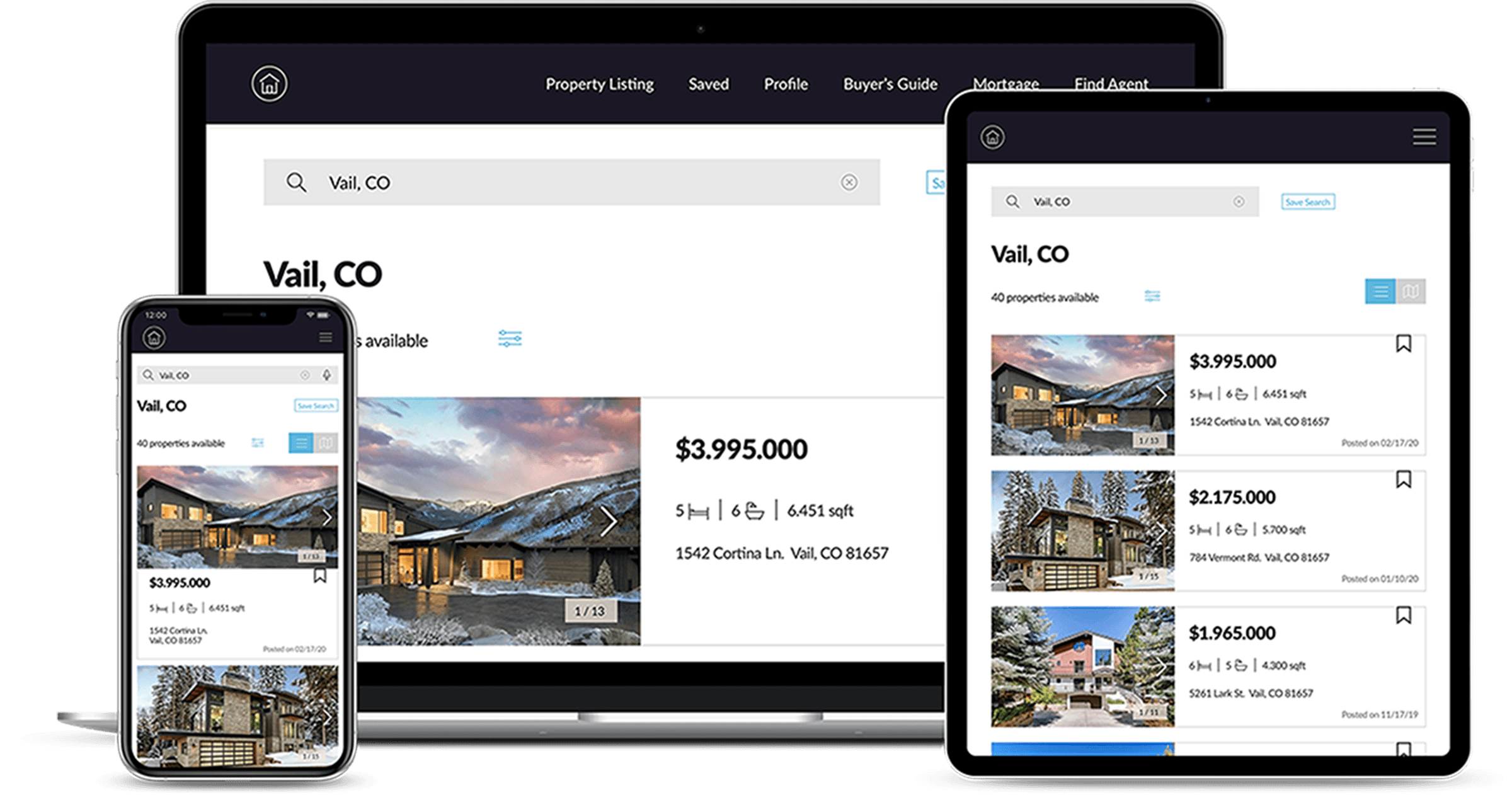
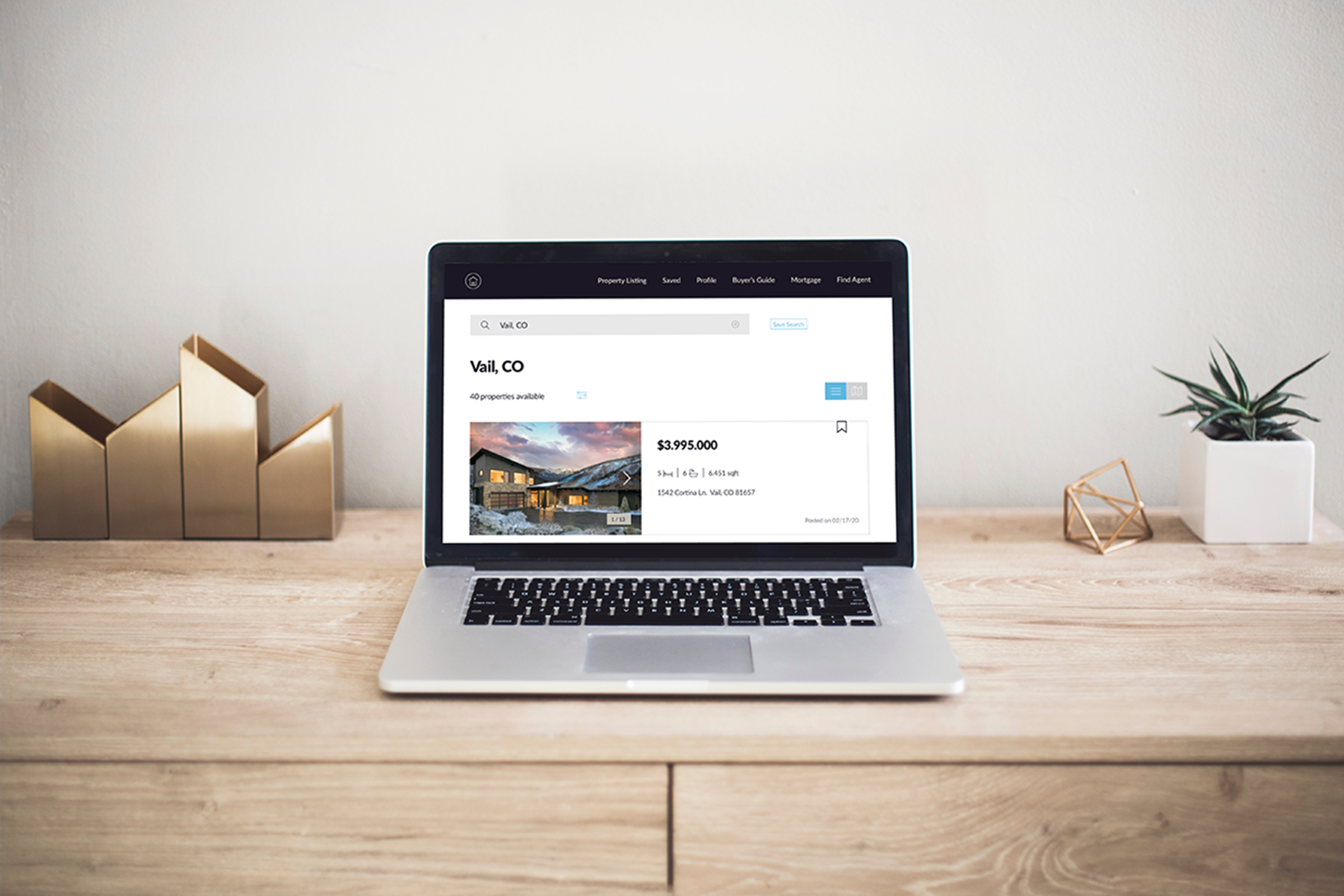
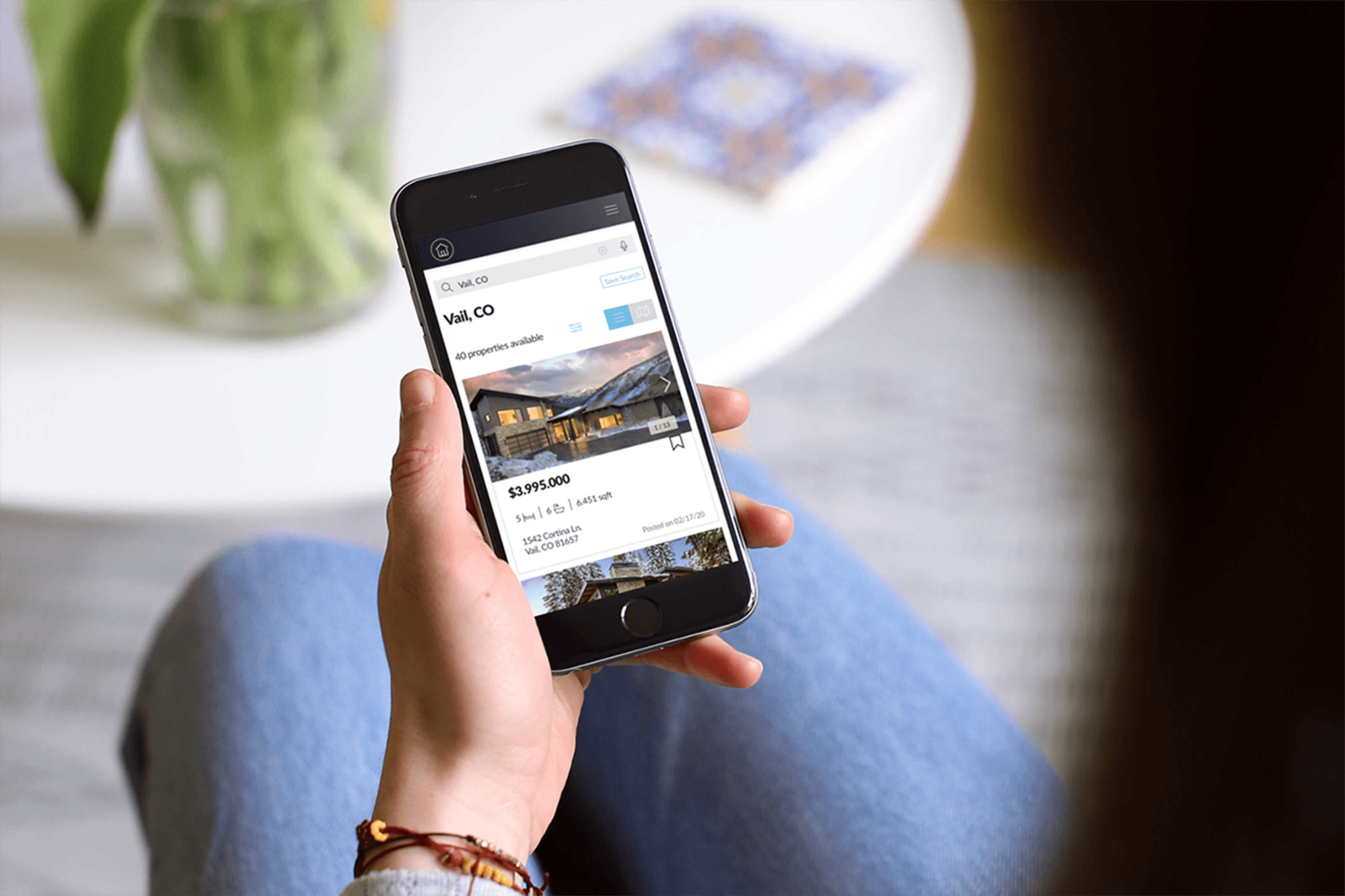
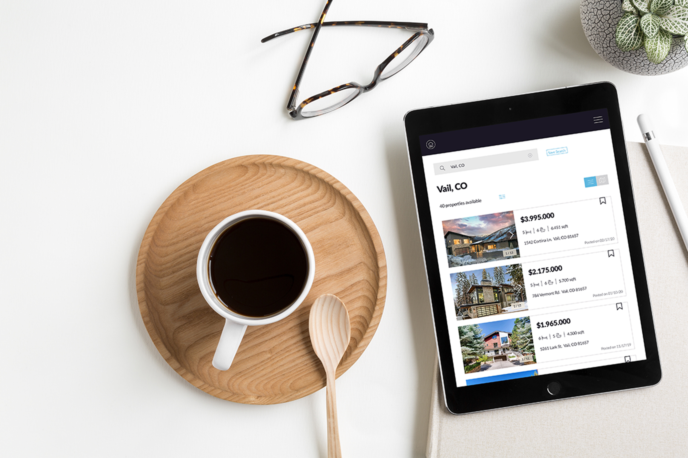
Responsive Design
© Sarah Eisman 2025
